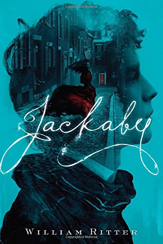
 Jackaby is the first book I received through The Book Drop, which I've talked about here. It was very exciting to get, and I blew through it in about three days, including one night where I disregarded how tired I was to get through the last 150 pages. In other words, I loved it. The summary of this book, as well as the cover blurb, describes this book as "Sherlock Holmes crossed with Buffy the Vampire Slayer". Having never seen Buffy, I can't really confirm whether that's a good analogy, but the Sherlock Holmes part is spot on, for all the good reasons. Though, I will say that the comparison to Buffy probably invites ideas of more action and kicking ass than exists in the novel. There certainly is a good bit of action and excitement, but this book is first and foremost a mystery. The book follows the story of Abigail Rook, our narrator, a young English woman who steps off a boat in New Fiddleham, New England in 1892. She has just come over from Germany after participating in an unsuccessful dinosaur dig, which she'd gotten to after stealing money her parents had set aside for finishing school tuition. Once she gets to New Fiddleham, she finds herself swept up in a fascinating case, chasing a serial killer after a victim was found and linked to other deaths. However, it turns out that Jackaby is no ordinary investigator: he can see the mythical, the folkloric, the supernatural. He can see fairy tale creatures and monsters. Abigail, for all her doubts decides to go along with it, and ends up getting more than she ever anticipated. "The waist cinches up in the back, and there are pockets sewn into the hem, here and here." Jenny gestured to the skirt. I really, really like Abigail, and I honestly wish that there were more women characters like her. She's quick, observant, gets a good bit into the action, but the book doesn't make her into a Strong Female Character (tm). Abigail actually cannot kick someone's ass with martial arts, but honestly, that's just fine. Her strength comes out in other ways. Abigail acts as our John Watson, becoming the grounding foil to R. F. Jackaby's absentminded professor. Abigail is praised for her ability to notice the ordinary, which sounds like an insult until Jackaby mentions that since he can see and looks for the extra-extraordinary, and the police are trained to look for the extraordinary as well, having someone who can pick out the minute, mundane details of the world is actually an invaluable ability. It makes sense to me. While we think it would be more exciting to be able to see the extraordinary, it can leave a gap in our observational power. This is one of the key aspects of this book that helps set it apart from Sherlock Holmes. Holmes is someone who can observe the tiniest aspects of a scene and link those aspects together in impossible ways. Yet, while he appreciates Watson, Watson acts mostly as a device to guide us, the readers, through the impossibilities of Holmes, and Holmes even gets angry at him a few times for not seeing what he sees. Having Jackaby not only appreciate Abigail's ability to observe the mundane, but emphasizing how he needs it--and knows he needs it--to complete his investigations is what made me fall in love with Jackaby, who could have easily just been another impossible detective. That, and the fact that he does try to understand the ways that pretty much everyone around him acts is really endearing. 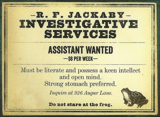 The job posting Abigail answersOf course, one of the other things that really made me happy was the amount of other women characters in the novel. In fact, if I counted right, there's actually an equal amount of women and men major and minor characters. And they're all fantastic, with their own quirks and distinct motivations. But possibly my favorite character, besides Abigail and Jackaby, would be Hatun. Hatun is a friend and informant for Jackaby. However, the reason Jackaby keeps going back for her opinions is similar to why he hires Abigail: because she views the world in different ways, offering a fresh perspective. I won't spoil the whole explanation, but I find it so fascinating how a book about people entering into the world of the supernatural still manages to blur the line between magic and mundane. Hatun is an ambiguous character, not in alliance, but in how she functions, and that facet of this book is so intriguing to me. I'm quite fond of magical realism (which I define as the blurred line between magic and metaphor), and while this book is firmly in the fantasy genre, Hatun still manages to confuse all of the certainties. It's a very interesting aspect that I hope is expanded upon in the sequels. One more thing: while there is a romance subplot in this book, I was very pleased that it remained subtle. Romance plots tend to be my least favorite parts of any books (though they're very numerous and very prominent in YA books). I'm fairly neutral about the romance in Jackaby, but I really did appreciate how it was kept as a subplot, didn't take over the book, and placed independent character development over having the two romantics' characterization dependent on each other.
I am extremely happy that this book came to me the first month I subscribed to The Book Drop. I don't think I would have heard of it or picked it up otherwise, and so I have to thank the staff of The Book Drop for choosing it. This book is an absolutely fun read. It has thrills, action, excitement, and well-rounded characters. I'm going to look up the sequel soon, as well as the novella/short story that takes place in between. I found this to be breezy, satisfying, light read that hit the spot, and, most importantly, was out-and-out fun. Here's to future reading! -EmilyParagraph
0 Comments
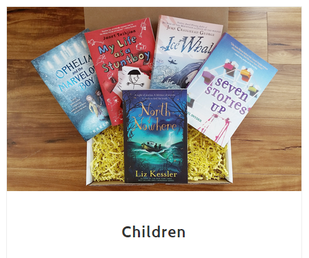
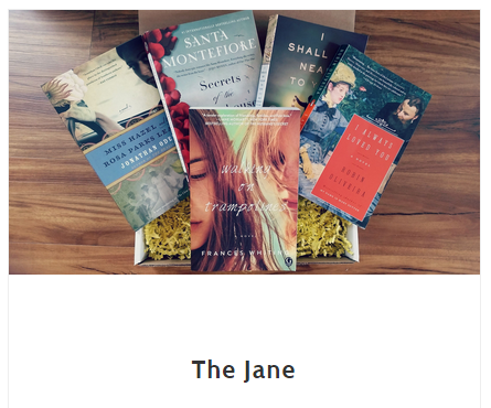
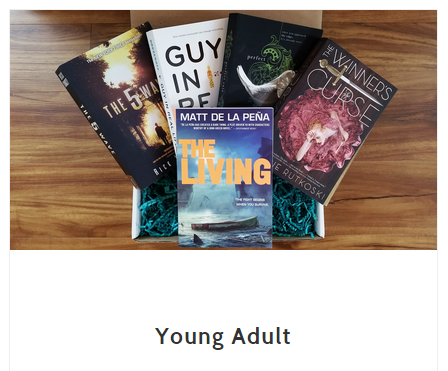
 A few months ago, I discovered and signed up for a book subscription box called The Book Drop. I had been browsing around the Booktubes and seen things like Owlcrate, the Bookworm Box, the Uppercase Box, and even Landfall Freight Co., which sends graphic novels. All of these looked amazing, cool and a good way to get at least one new book once a month. They're so expensive, though, often costing $30 for one month, plus shipping. Granted, the price does even out once you consider the fact they all add trinkets and knickknacks to the package, but as someone who lives in a dorm (and likely my parents' for awhile once I graduate), I really don't need a bunch of nice junk to clutter up my space. No, I probably don't need more books, either, but I feel more fulfilled with a book than Pop Vinyl Figures. It's great for those who also adore those things, but I was looking for something a little simpler for my situation. Which is when I stumbled upon The Book Drop, a subscription box maintained by Bethany Beach Books, a small, independent bookstore in Delaware. I poked around their site, and was really impressed and excited about what I found. They're very much book-centered boxes. The trinkets that come with it each month are signed bookplates (if the book's not signed), bookmarks (sometimes signed), promos for other books the staff of BBB enjoy, and occasionally a bonus book!  Some September 2015 books sent out by The Book DropWhat really sold me on The Book Drop, however, was the variety of box types it offered. Unlike most other boxes, which focus on YA, there are boxes filled with adult books, young adult books, and children's books. But then the boxes go even further. For adult literature, there's The Jane, filled with adult contemporary, historical fiction, and literary* reads, and The Ernest, which has thriller, action and some non-fiction. The YA boxes come in Adventure ("For the reader that likes to be on the edge of their seat!"), Love and Relationships ("Mostly contemporary reads that focus on love & relationships."), and A Little Bit of Everything ("Perfect for the reader who likes to read a variety of books!"). The children's boxes are similar to the YA in descriptions: Adventurous, Pleasant ("For the reader who likes stories about friendship, animals, nature, & pleasant topics."), and A Little Bit of Everything. Its really nice to see such a variety of choices in a subscription box. I would maybe like to see a cross-reading levels box (as in, a dedicated Science Fiction/Fantasy box that could come with an adult, YA or children's book), but that's just me, and the variety it has now is incredible. There's nothing wrong with people subscribing to a dedicated YA box, but not everyone does read them, and even if someone does, they might appreciate some adult or middle-grade books one in awhile. Which is why I think this box is really nice. Well, all right, the reason this box finally sold me on it is that it's not too expensive (the college student said, as she sighed wistfully in relief).
Pick your sweet, sweet poisonThe different reading levels have different prices, which makes sense if you know the typical prices of adult vs. YA vs. children's books. Adult boxes start at $16/month, dropping to $15 if you get the 6 month subscription. YA boxes are $13/month, $12 for 6 months. Children's boxes are $9/month, $8 for 6 months. I think it's a really good deal for what you get. Like I said before, the $30 price tag for the other boxes also covers neat little items that go along with a theme or somesuch. The low prices of The Book Drop cover just the book and a signed bookplate and bookmarks. Simple items, a simple box, but totally worth it. The site promises that: Each month we will pick one of our favorite new reads that you may not have discovered otherwise. Our mission is to spread the love of reading by exposing people to really amazing books. We all have busy lives and unless you are surrounded by books all day (like us lucky folk), it's a bit overwhelming to pick out one REALLY good book when there are so many options. That's what we are here for... And I think it lives up to that promise 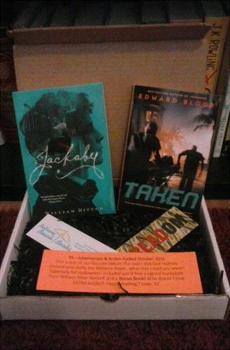 My first box, the October 2015 YA Adventure box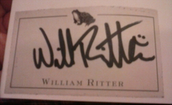 I got my first box about a week-and-a-half ago, and I was so excited to open it. I signed up for the Adventure YA box, so I was eager to see which book they'd picked out to share. The book I got was Jackaby by William Ritter, which I'll probably review in another post. And not only did it come with a signed bookplate, but a whole other book! My bonus book is Taken by Edward Bloor, and it looks really, really interesting. It also takes place in Florida, which is where I live, so that's a neat touch. If you've been looking at book subscription boxes, I'd highly recommend this one. Between it's genre variety, age variety, the promise of getting a hidden gem, and the price, The Book Drop delivers on all points. I see myself subscribing to it for a long time. -Emily Paragraph *I have personal issues with the use of "literary" to mean "dense, slow-paced and character-driven, therefore artistic and better". I'll get into it another time, but just know that I think it's a purposefully vague, elitist, exclusionary term. Same with "Genre Fiction" and "Popular Fiction."
Back in the spring semester, I took a course called "English Capstone." It's a required course to take for English majors, taught by rotating professors. So, no two Capstone semesters are going to be the same. I just so happened to take mine with a professor who's whispered about throughout the department as someone with some of the hardest tests to take. Incidentally, he's the Old and Middle English professor, and he adores Arthurian lore. The whole semester was based around the idea of adaptations of the lore, especially into movies. It's always nice when watching a bunch of movies is required for a class. And even better: this professor known for giving out 2-4 question exams declared on the first day of classes, "No tests!" Be still my heart! But then, "You choose your own final project." Free reign over a final project--or even just A LOT of reign over a final--can be kinda daunting. I immediately got my base idea: illustrations. Since the idea of the class was to explore adaptations of Arthurian lore, I decided to create characters that drew from the lore in broad strokes. In most of the Arthur stores, the characters all remain the same. There's always the Arthur, the Guinevere, the Lancelot, the Merlin, the Percival and the Morgana. My idea was to take these characters' stories, typical characterizations, and broad, overarching themes, and create illustrations of characters that could exist in a cohesive world that was not about Arthur and his Knights, but about a king, a journey, loyal followers, and more. So, I took existing original character designs that I had floating in a limbo of "no solid backstory or features" and put them in these roles. As I drew them, a more solid story started worming its way out of the back of my brain. As I drew, I figured it'd be really cool to maybe one day write the entire adventure as a webcomic. As it stood then, the only thing I had time for was a series of four illustrations of the main cast. Naturally, the first place to start at was the King Arthur analogue: 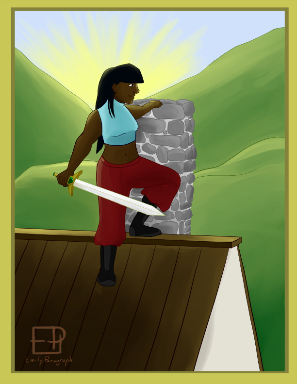 There is so much about this picture that I love. The pose worked out, the linework is alright, and the semi-painted style was pretty fun to experiment with. Her clothes... yeah, they need some redesigning and recoloring. The sword is one of my favorite parts of it, though, simply because of how well it came out. All of these illustrations are somewhat rushed, I will admit, and I'd like to rework them in the future when I have more time to take care and really plan them out. When, you know, I don't have three other classes and research papers to work on. Since this is (or should be) my final semester, I'm hoping to get on to better illustrations around the new year. Alas, like I said, I started to rush them all as the semester chugged along. This was the only picture I was able to do the semi-painting style on. The rest, I used simple shading to help save time. I did the next two--the Merlin and Lancelot analogues--around the same time: 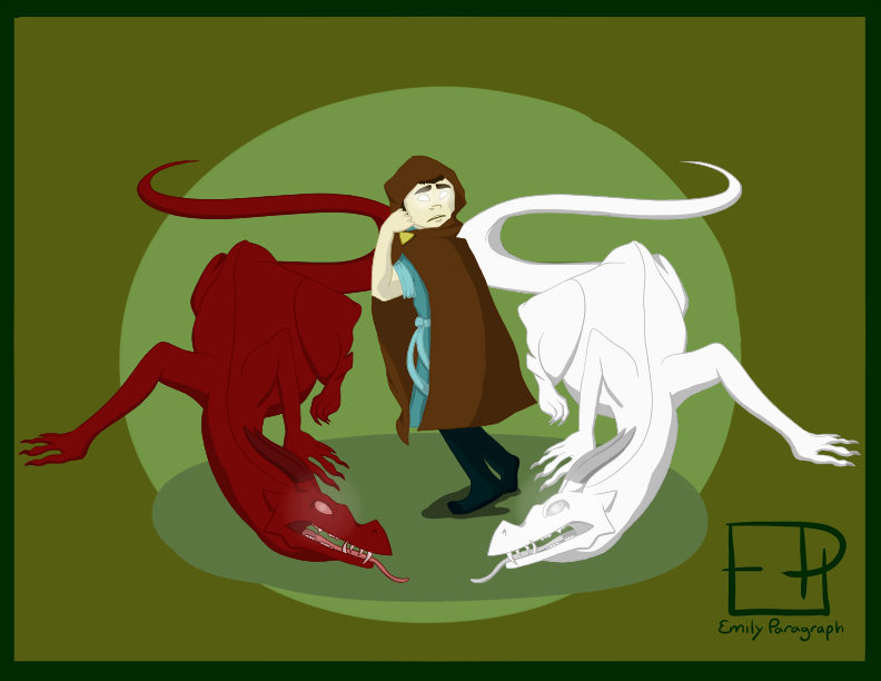 One of the things that intrigued me about Merlin as I read The History of the Kings of Britain by Geoffrey of Monmouth was the symbolism in Merlin's prophecies. One of the first and most striking images is that of two dragons, one white and one red, constantly battling each other for dominance over the land. In all honesty, I'm still proud of the fact I was able to draw a dragon for this. My Merlin character is unlike Geoffrey of Monmouth's, however. She's unused to her power, a little scared of it even, and doesn't know what to make of her visions. If I were to eventually adapt this into a comic, it would start with her running off after having a vision, spending years searching for the one who would lead the nation(s) back into glory and righteousness. 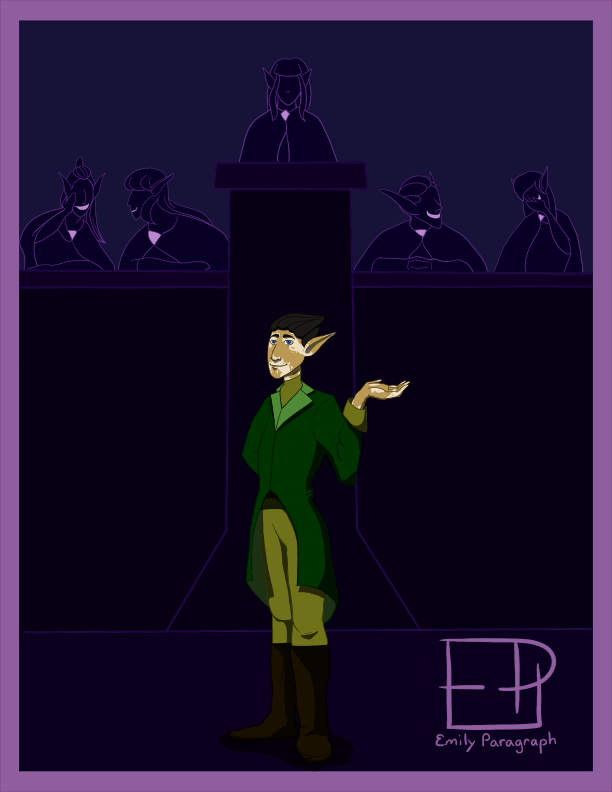 This is probably my favorite background in this series. I had this idea of the Lancelot character coming from a place of privilege, insofar as her race imposed their arrogance over others, ruling with a tight grip on their territories. The faceless figures turned out much better than I expected, even if the values of the colors are a little too close together to display properly on different computers. One of the things that constantly characterized Lancelot in a lot of the stories and movies we discussed was his arrogance and ego. Even when his unnecessary self-righteousness was out of ignorance, the Lancelot character always had that sure, focused mind. I think that's why his affair with Guinevere is so shocking and dramatic. Lancelot knows he is one of the strongest, most pure knights, so that sort of transgression would not only ruin his (and her, honestly) reputation, but also severely confuse him because he's never had much experience in sinning. The last illustration was the Guinevere analogue: 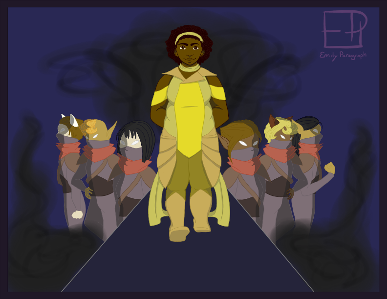 Okay, I'll admit: this is the character I took the most liberties with. I just suddenly had this image in my mind of Guinevere as the leader of a rebel group, and it became something I desperately wanted to draw. Partly, I think, because Guinevere more often than not gets stuck in the role of "wife" and "queen" and is often a really static leg of the infamous love triangle. It makes sense, seeing as how the stories began at a time when women had fewer options, but it's something that always irritated the hell out of me. I knew I wanted to keep her in a position of power, though. If I go on to develop the story, I might even write her as the hidden heir to a kingdom occupied by the elves. Giving her a much more active role in the story was my goal, and I think this is the illustration that may excite me the most. Probably because I had so much free reign with the character... and because I managed to draw several other, fairly detailed people in it with a good amount of success. I would definitely keep the romance aspect of her, Arthur's, and Lancelot's characters if I expanded on this. Despite it most likely being a ripoff of Tristan and Iseult, written by a Medieval author as commissioned GuineLot fanfic for a countess, the romance angle has been accepted as an inevitable part of the Arthurian canon. If anything, it's due for some updating. In the end, my presentation did not go over extremely well. I didn't fail, I just didn't prepare well, and I didn't explain the idea of "adapting in broad strokes" as well as I should have. Honestly, I'm alright with that. I'd be less fine if I had failed, obviously, but I think the experience was and is the more important thing for me. This was a fantastic project for me to do, mostly because it let me be creative while working with some restrictions. It helped me coalesce some ideas and bring together what were disparate characters. The overall idea definitely needs some more thought, and I still want to update the designs and illustrations, but for now, I'm happy with where it is, and I'm proud of myself for accomplishing this series. Here's to more good ideas, and to further expanding my comfort zone! -EmilyParagraph
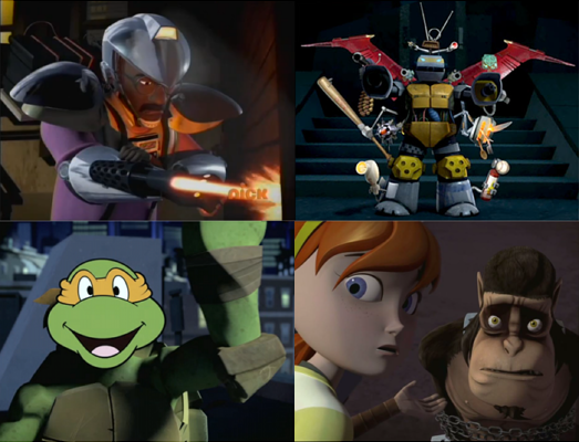
Teenage Mutant Ninja Turtles (2012)--Season 3 Epsiode 8: "Vision Quest" (And A Few Other Thoughts)1/22/2015 Just a warning: I've seen a few more episodes since my last entry. As in 2 1/2 seasons. Spoilers abound.  If there’s one thing TMNT 2012 has consistently been good at, it’s looking good. Even the comparatively boring human designs are distinctive from one another, and all of the mutants are very creative (yes, even Spider Bytez, which is honestly the most unique spider monster I’ve ever seen, no matter how doofy everyone else considers it). And everything from the backgrounds to the color palette goes into making this one heck of a good looking show. However, I often get the impression that TMNT 2012 is so caught up in looking good that it forgets that it needs to make sense, too. It’s been trying to have a consistent and dramatic storyline, therefore it can’t just do whatever it wants narrative-wise whenever it wants, because that’s not what we’ve been led to expect. If the show had been episodic from the start, I would not be complaining about this. "Vision Quest" is yet another episode in the series that looks incredible, has incredible character designs and set pieces, good action and is overall good , but yet again contains a disconnect between what I’m told to feel and what I actually experience. The biggest reason I’m drawn out of the episode, I think? Because it went out of its way to look cool instead of make a wholly compelling story, complete with an extraneous character who has extreme and unfulfilled importance put on it. 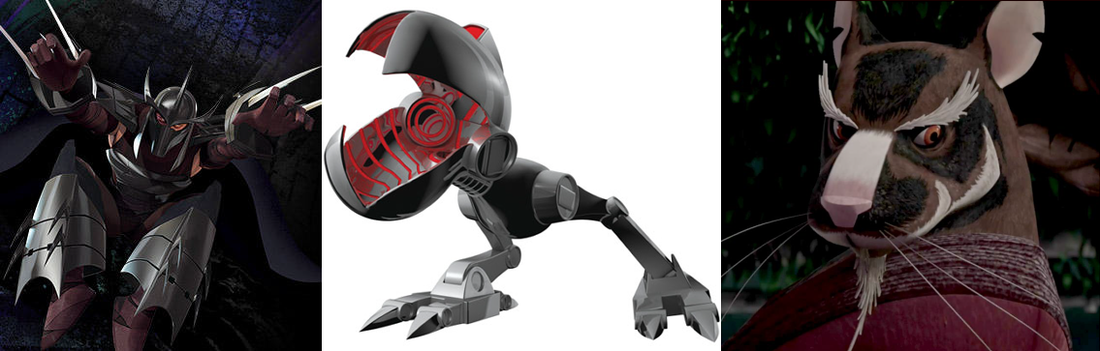 I was right when I said in my second entry that the early episodes of a show are hardly as good as the later ones. I also said that I'd go easy on the first ten because those are usually the ones that trip up the production team before everyone settles in and a steady rhythm is established and the show really starts to cohere (if it ever becomes good, which Ninja Turtles 2012 is). At any rate, I'm really glad I've stuck with it, even if the first eleven episodes have been fairly awkward and disjointed. There are still good episodes, but "good" in that way that'll keep your attention rather than living up to the hype and potential of a show. Starting with episode 12, though... boy, oh boy, does the series become what it's been hinting it could be for the last half a season. 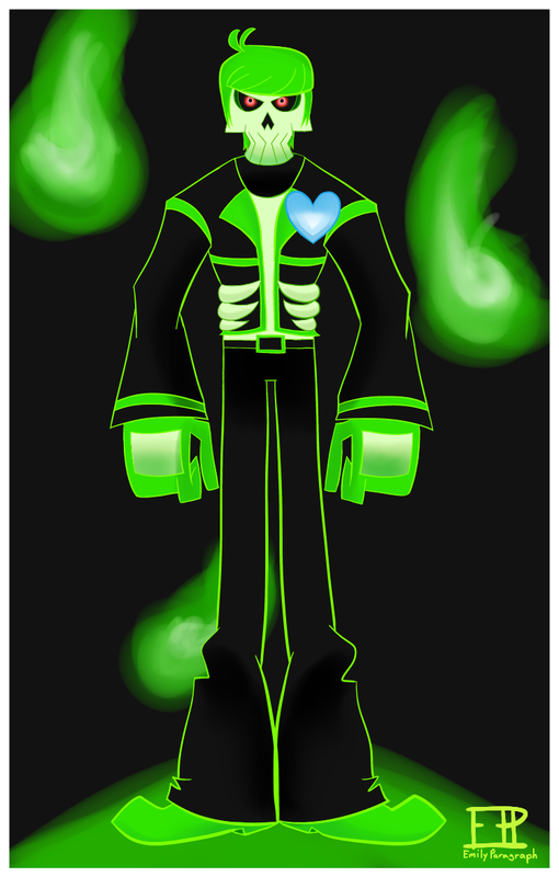
So, I jumped aboard a bandwagon. That Mystery Skulls' "Ghost" video is really well done, tho. I thought Lewis, the ghost, looked a bit like Mike Chilton from Motorcity, so this happened.
I decided to go over four episodes this time. Not because I didn't like them or thought they were meaningless. No, actually, it's partly because I just don't have as much to talk about with all these, partly because I watched ahead. I found them all quite cohesive and highly enjoyable. They're also, importantly, fun, a good sense of humor and timing coming from them. And when plot gets involved, they're well-grounded. I Think His Name Is Baxter Stockman That's a shell of a title.
It's fairly obvious that this incarnation of Stockman (Dr. Baxter Stockman? Just Baxter Stockman? Does he have a PhD?) is based in the '87 version of the character. He's dorky looking, he's got a sweatervest, and he doesn't seem to be as big a threat as the Krang or Shredder. He might also turn into a fly like the 1987 Stockman did. I wouldn't be surprised. All in all, he looks like he's going to be a delight to watch. 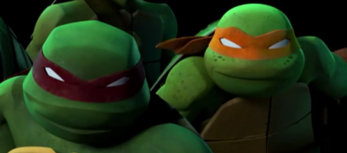 The early episodes of any given series will hardly ever be as good as the later ones. Usually, the further a series goes, the more cohesive it becomes—the writers sink into the characters and world, and the actors bring more life and color into their roles. That’s not to say the episodes can’t be good, just that the ones coming after will usually be better.
I say this because it’s one of the reasons I’ll generally be forgiving of this show in the first five to ten episodes. I am intrigued to see what happens, since the pilot was so good, but I also know that things of a serial nature will not remain static. A bad episode is still a bad episode, but a boring or predictable or slightly unfocused one has more leeway. That being said, episodes three and four—“Turtle Temper” and “Old Friend, New Enemy” respectively— provide examples of both: a good, if mediocre episode that will probably not be indicative of the whole show, and a downright bad episode.  I don’t know why I’m just now getting around to watching the 2012 Ninja Turtles series. Well, I kind of know, but it does feel like a shame I’m getting here about two years late. I’ve been a fan of the Turtles since I was young, and despite being born in 1991, I still have some nostalgia for the 1987 series. When the 2003 series came on air, I was an ecstatic middle-schooler. It was like old friends returning from a long vacation. The news of the 2012 series had a similar effect. But it being barely three years after Turtles Forever concluded the second series in 2009 with a particularly grand finale, and I being two years into college, I was a little skeptical. Nostalgia dies hard, but this was the Ninja Turtles we’re talking about, so I gave it a go. But never kept up. But I’m here again, two years later, ready to give it an actual go this time. And this is quite a new start for the Turtles. Viacom owns it now. It’s CGI. The kids who were five when the first cartoon came out are in their 30s and ready to share their fandom with another generation. So, here’s my initial reactions to the 2012 Turtles and the pilot, “Rise of the Turtles”. If I had to grade TMNT 2012 on its character design, it would get an A+++. It’s been awhile since the Ninja Turtles got some innovative design, but even giving them differently colored headbands and initials on their belts back in the 1987 series never fixed the problem of the turtles’ identical designs. It’s honestly exciting to see the effort put into each different model and how the designs give a further sense of characterization. The 3D animation probably gives the animators more freedom to play, since the characters don’t have to be redrawn frame by frame by frame. Thanks to this, this is probably the first Turtles incarnation to make a concerted effort to stay away from sameface. 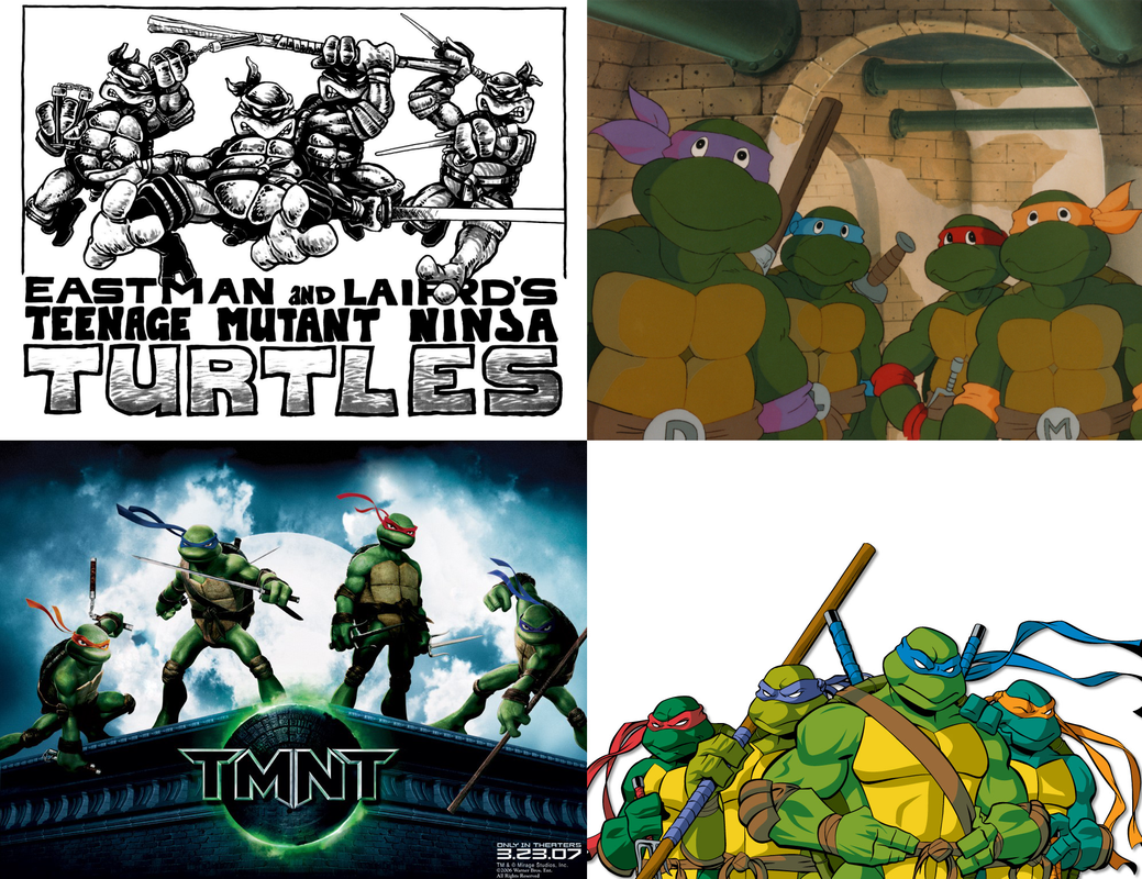 You might think the 2003 show was getting fancy with the different skin colors, but let me just say this: Pallet SwapsI am a writer. I always have been, I always will be. Writing has been what's driven me since before I knew I loved it--storytelling, composing, talking fictions to myself. I had the best fourth-grade teacher, however, and from then on was able to focus what I loved and learn about it and expand my skills.
I drew and colored, too, as children do. But I never thought that I could be a great artist, someone who could confidently or competently draw or do other forms of art. I doodled. That's what it was, and that's kind of what it still is. However, when I got into high school, I met my best friend (well, re-met, but that's an entirely different story). She was and still is a dedicated visual artist. Whereas I was in the Creative Writing department of our arts magnet, she was in the Visual Arts department. As our refound friendship truly got going, I decided that maybe I could learn. I mean, I doodled after all, and I figured I couldn't get any worse. I'd certainly never get anywhere if I didn't try. So I did: |


 RSS Feed
